Unidad Formación Implantología
September 7, 2017
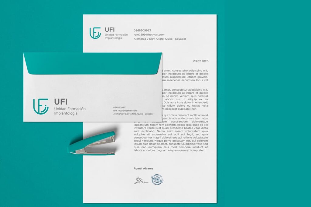
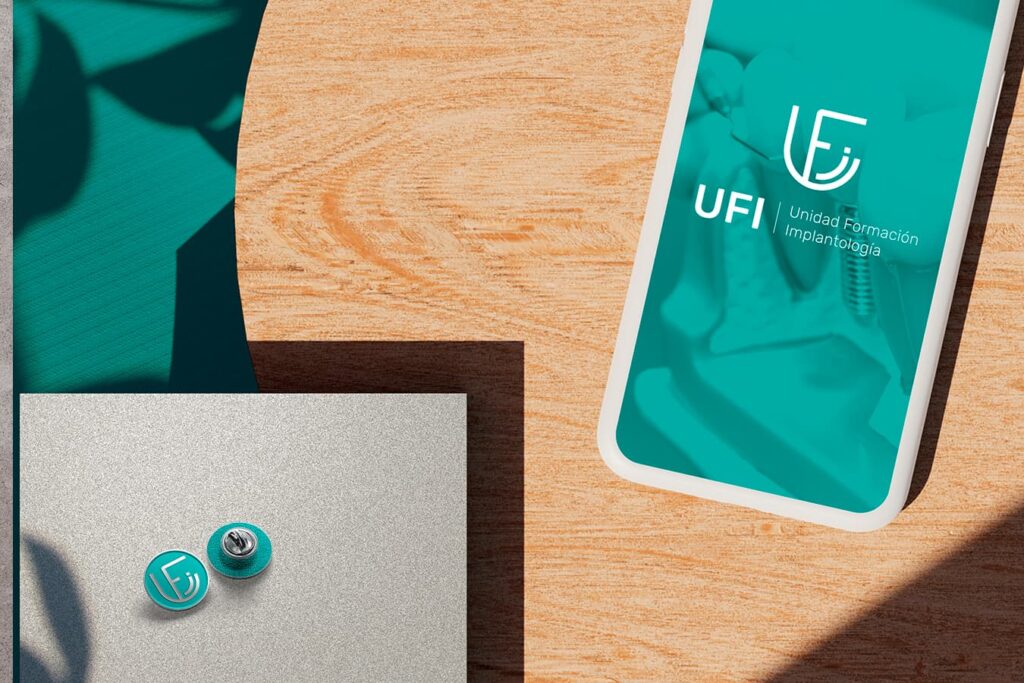
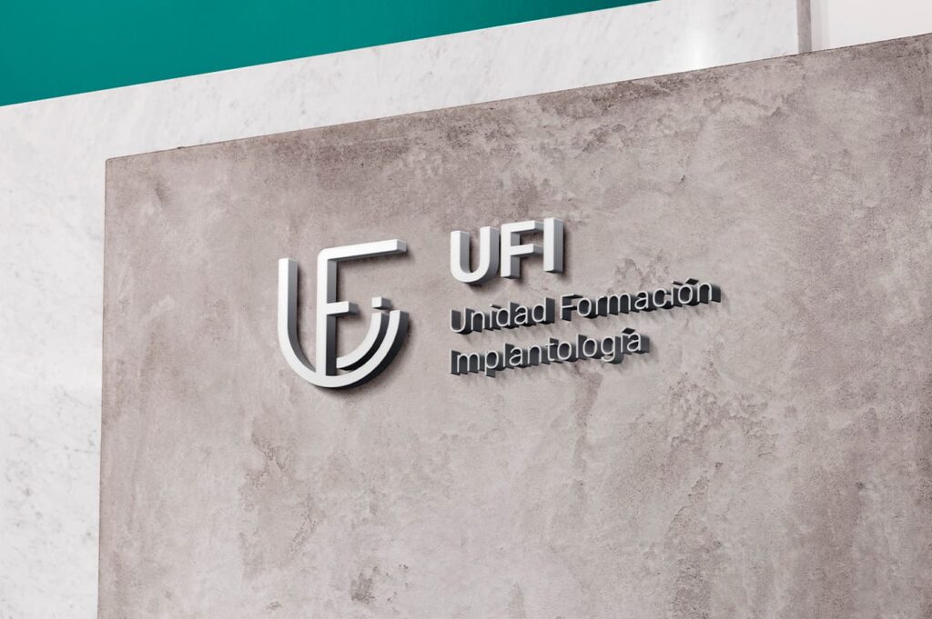
Brand creation of an educational implantation center, located in the city of Quito, Ecuador. Our client came to us with the need to rebrand his brand. An Imagotype was designed that is composed of Isotype + Logo, this combination of the icon and the brand name make up a unit and when they are separated, both merge.
Turquoise was used as the main color for our brand, because it is a color associated with the health area in tune with its purpose, in addition to being a fresh color; combining gray with a secondary tone as a neutral color.